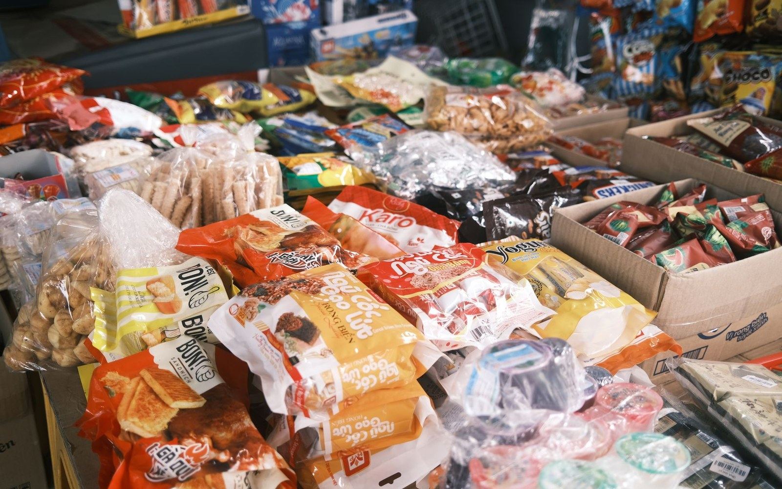
The last captive audience in a building designed to keep you moving.
01The only place you stop
Every other fixture in a supermarket is designed around motion — the perimeter loop pulls you forward, the end-cap interrupts your path, the aisle compresses and releases. The queue does the opposite. It pins you in place, removes the excuse of somewhere to be, and leaves you facing the one wall in the building that was designed with your immobility in mind.
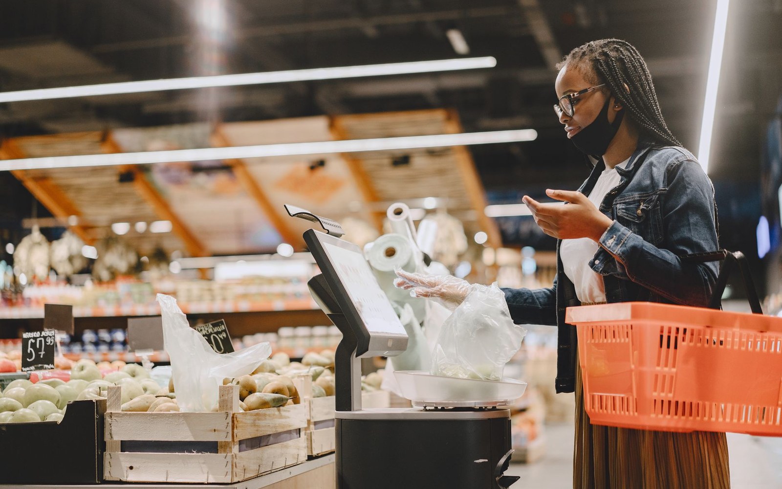
The one place in the shop where a shopper is stationary and bored, stocked accordingly.
Fig. 2 · Photo: Gustavo Fring / Pexels
Retailers have understood this since at least the mid-twentieth century, when candy and magazines first colonised checkout lanes in American grocery chains. The insight was simple: a stationary shopper with thirty seconds to a few minutes of boredom will look at whatever is nearest. The only design question is what to put there.
The answer, settled across most of the world's supermarket formats, is a tight cluster of high-margin, low-deliberation products. Confectionery, chewing gum, lip balm, batteries, small toys, pocket-sized snacks. The unit prices are rarely checked because the units are small and the amounts feel trivial. Nobody compares the price-per-gram of a checkout chocolate bar against the same brand in aisle seven. The queue discourages comparison; that is most of its commercial function.
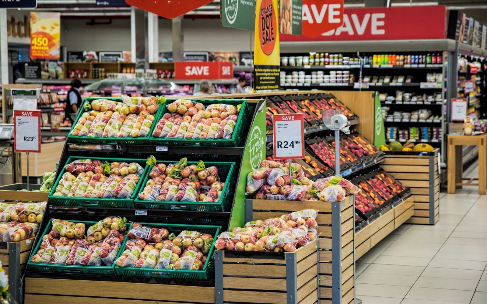
The last metre before the till is the floor’s final fixture.
Fig. 3 · Photo: Pixabay / Pexels
Physical design reinforces the effect. Queuing lanes in larger stores are typically formed by rigid barriers — the kind of retractable belt or fixed metal rail that prevents drift. Drift matters because a shopper who can wander will scan the floor, re-engage with other categories, remember something they forgot. One who cannot is a reader without a book. The literature on retail dwell time consistently finds that product contact increases with proximity and boredom, two conditions the queue manufactures together.
The answer, settled across most of the world's supermarket formats, is a tight cluster of high-margin, low-deliberation products.
The self-checkout shift has complicated the formula without dismantling it. Banks of self-checkout machines shorten individual queue time, which reduces the window for impulse contact. Retailers have responded by placing impulse fixtures beside each terminal rather than only in the lane approaching it, and by filling waiting areas in front of machine banks with the same low-deliberation product mix. The geography changes; the principle holds.
Online retail has its own equivalent — the end-cap of the internet being the add-on offer on the checkout page — but the physical queue retains one advantage no screen can replicate: it is genuinely inescapable. You chose to be there. You cannot close the tab.
What makes the queue remarkable is how little it needs to work. It requires no special offer, no anchor price, no loyalty data. It needs only a bored adult, a small object at hand height, and a transaction that has not quite finished yet.
This page describes a retail technique and where it came from. It contains no guidance about money, no products and no offers.
Next · 05 Record
Loyalty is a data programme →