
Every spatial trick the grocery store uses has an online equivalent — and the digital version is tracked to the pixel.
01The layout you don't notice
Walk into a supermarket and the floor does things to you: it slows you at the entrance, routes you around the perimeter, places the most profitable items at eye height, and interrupts your path with end-caps at the end of every aisle. The architecture is persuasion. Online retail does all of this, just without the architecture.

Position, interruption and anchoring all have direct equivalents on a screen.
Fig. 2 · Photo: Helena Lopes / Pexels
The homepage is the entrance and the decompression zone folded into one. A large hero image, rarely a product, sets a mood before anything is sold. Below it, the first items you see are not the ones you came for — they are the ones the retailer wants you to notice first, selected by the same logic that puts flowers and produce at the front of the store. Primary screen real estate at the top of the page, sometimes called the "above the fold" zone, is the eye-level shelf of e-commerce. It is allocated, not accidental, and in most large platforms it is paid for by brands in exactly the way physical shelf position is.
Scroll down and the page unfolds like a floor plan. Featured categories sit where the fresh perimeter would be. The ambient middle — the long, navigable aisles of commodity goods — is relegated to search. You have to go looking for them, which means the retailer controls what you encounter before you get there.
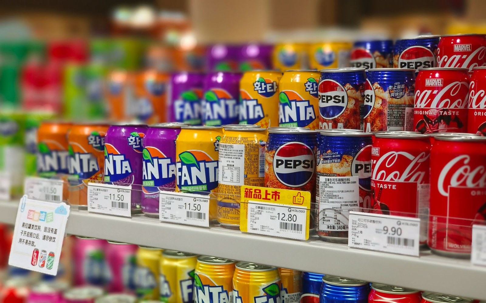
Online the same decisions are measurable in a way the shop floor never was.
Fig. 3 · Photo: 乾 黄 / Pexels
02Position, interruption and the measurable anchor
Shelf position online is called sponsored placement or promoted listing. A brand pays to appear in the first row of search results, which is the digital equivalent of the eye-level slot. The difference from the physical shelf is precision: the retailer knows exactly how many people saw that placement, how many clicked, and how many bought. The supermarket buyer negotiating a gondola end never had that data. The e-commerce category manager has it updated hourly.
A large hero image, rarely a product, sets a mood before anything is sold.
Interruption — the end-cap function — arrives as a banner, a pop-up, or a "customers also bought" block inserted mid-scroll. These are not organic suggestions. They break the route the shopper was on and introduce an item not in the original plan, which is precisely what a well-placed end-cap does to somebody walking an aisle. The mechanism is identical; the trigger is a scroll position or a dwell-time threshold rather than a physical turning point.
Anchoring works the same way it always has, but faster and at higher frequency. A price shown with a crossed-out predecessor is an anchor — the original number exists to make the current one feel like relief. Online, these can be personalised: the anchor shown to a price-sensitive shopper identified through browsing history may be set higher than the one shown to a less elastic buyer. In a shop, the ticket on the shelf is the same for everyone. On a screen, it need not be.
03What the screen adds
The physical store was always partly a measurement device — footfall counters, mystery shoppers, basket analysis at the till — but it was a slow and partial one. The screen removes that limitation. Every pause, every scroll reversal, every item added then removed before checkout is recorded. Heatmaps show where attention clusters on a product page; A/B tests run simultaneously on different visitor segments to determine which image, which price display format, or which button colour drives more completions.
This is the real difference between the shop and its digital equivalent. The persuasion architecture is the same in structure and intent. But the physical store could only infer what worked from aggregate sales data gathered over weeks. The screen knows what worked on each individual visitor, in each session, and it adjusts. The floor plan that a supermarket redesigns every few years, a digital retailer can retest daily.
The machinery is familiar. The instrument panel is new.
This page describes a retail technique and where it came from. It contains no guidance about money, no products and no offers.
Next · 06 Screen
Urgency timers and stock scarcity →